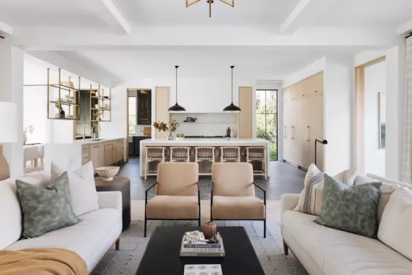
Interior Designer Kate Marker's Practical Advice for Choosing Paint Without the Anxiety
Interior designer Kate Marker, author of 'The Love of Home,' shares practical strategies for selecting paint colors and finishes without feeling overwhelmed. Her advice focuses on emotional goals, undertones, and testing colors in real light to avoid decision fatigue.
Choosing a paint color can feel like a high-stakes decision, with countless brands, finishes, and shades vying for attention. Interior designer Kate Marker, who has painted numerous rooms throughout her career, offers a systematic approach to reduce the stress and make the process more enjoyable.
Marker, the founder of Kate Marker Interiors and author of the newly released book The Love of Home, dedicates an entire chapter to stress-free painting. In a recent interview, she shared her top strategies, emphasizing the importance of emotional intent, careful testing, and resisting fleeting trends.
Start with the Feeling You Want
Before opening a single paint swatch, Marker advises homeowners to define the emotional goal of the room. Whether it's a serene bedroom or a lively kitchen, the desired mood should guide color choices. She often draws inspiration from nature—studying the textures of stone, the layers of a forest floor, or the hues of a sunset. For more unexpected ideas, she suggests looking at architectural salvage yards, vintage textiles, and historical color palettes from different eras.
“These can provide unexpected color combinations and textures that translate beautifully into interior design,” Marker notes.
Pay Attention to Undertones
Once a palette is in mind, Marker stresses the importance of undertones, even in neutral shades. “Even within white or beige, undertones can range from warm to cool,” she explains. The key is to maintain consistency—pairing warm whites with other warm tones and cool whites with cooler ones to avoid visual dissonance. She also highlights the role of texture: “Combining smooth and rough finishes can add depth without clashing.”
Don't Chase Trends, and Test in Real Light
Marker cautions against following design trends too closely, especially for first-time painters. “It's easy to feel overwhelmed or pressured to choose bold or unconventional hues, which might not resonate personally,” she says. Instead, she recommends selecting colors that feel natural and comforting.
Another common pitfall is making quick decisions under artificial lighting. Marker advises taking samples home and observing them at different times of the day, under both natural and artificial light. “Avoid making quick decisions under artificial lighting, and always test colors at different times of the day,” she says.
Let Paint Share the Spotlight
To reduce the pressure on paint as the sole source of color, Marker suggests incorporating color through other elements. “I love introducing color through art, rugs, textiles, and greenery,” she says. “Sometimes a single, well-chosen piece—like a vibrant painting or a richly textured throw—can infuse a room with personality.” Vintage books, ceramic vases, and colorful upholstery are other options she recommends.
For those ready to embrace color, Marker advises starting with a single shade. She often gravitates toward soft sage or deep olive green, noting that greens evoke calm and timelessness and can be both grounding and versatile. “Green can range from traditional to modern,” she says. “It also resonates with my love for nature, symbolizing an earthy natural feeling.”
Finally, Marker encourages homeowners to think of their color choices as part of a larger narrative. “Consider how the colors will transition from one space to another,” she says. “Let the colors tell a story that feels authentic to your style and personality.”
By focusing on emotional goals, undertones, and real-world testing, painting a room can become a more deliberate and less daunting task.
Comments 0